Sesam
Arkitekter
Art Direction, Branding, UI/UX Design
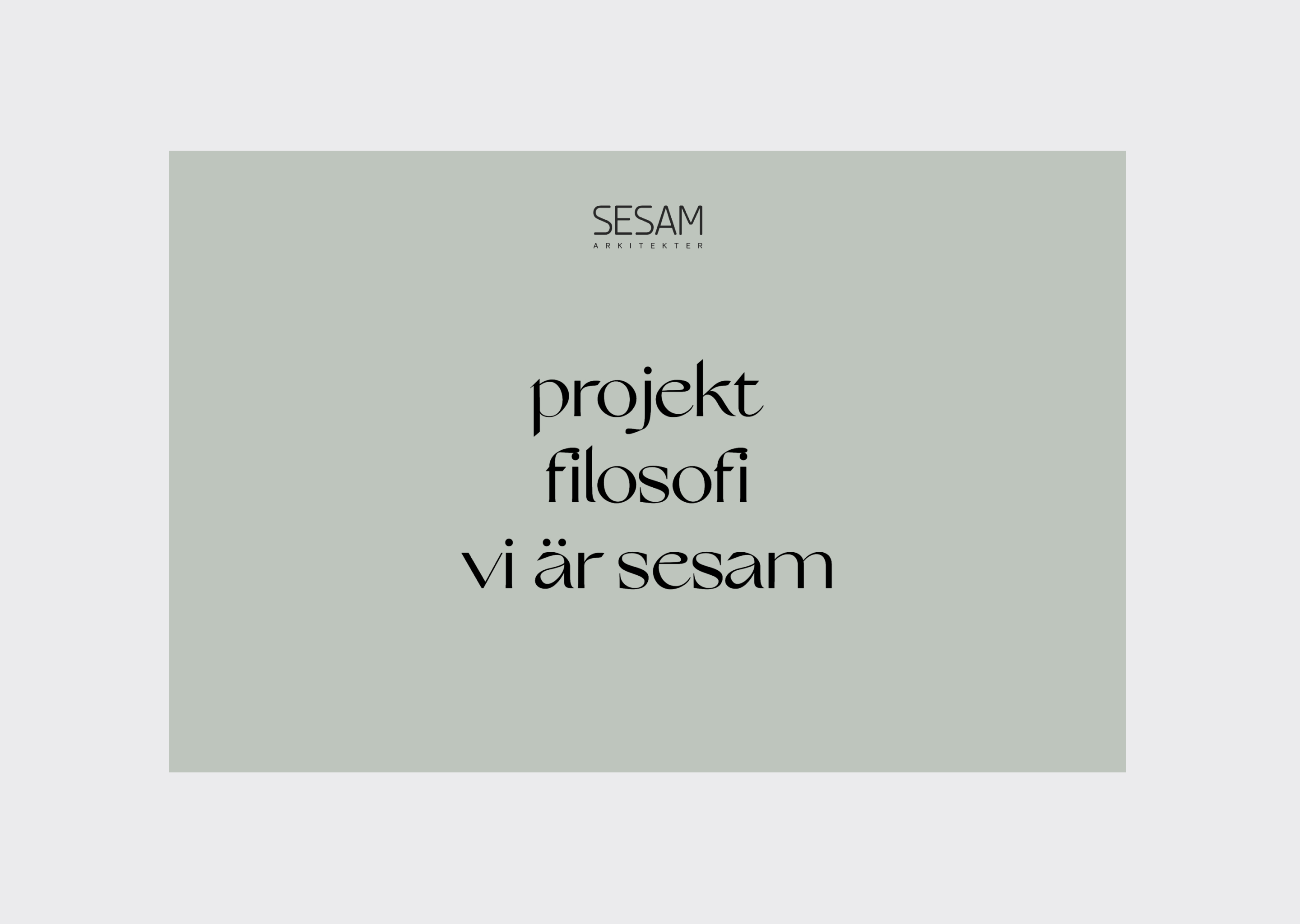
The project was to give life to the visual expression of Sesam Arkitekter. They wanted us to craft a digital experience while improving their brand. As their own approach to architect projects, they wanted us to start form a blank paper - without any past relation to what they had before. One of the only requirement was to make Sesam stand out in the noise of the typical architectural firms.
Agency - Creative Army
Photographs/Project Manangement - Stefan Fallgren
Art direction/UI & UX Design/Basic Webdevelopment – Sandra Lindkvist
Development – Daniel Ronkainen
Retusch – Niklas Strandberg
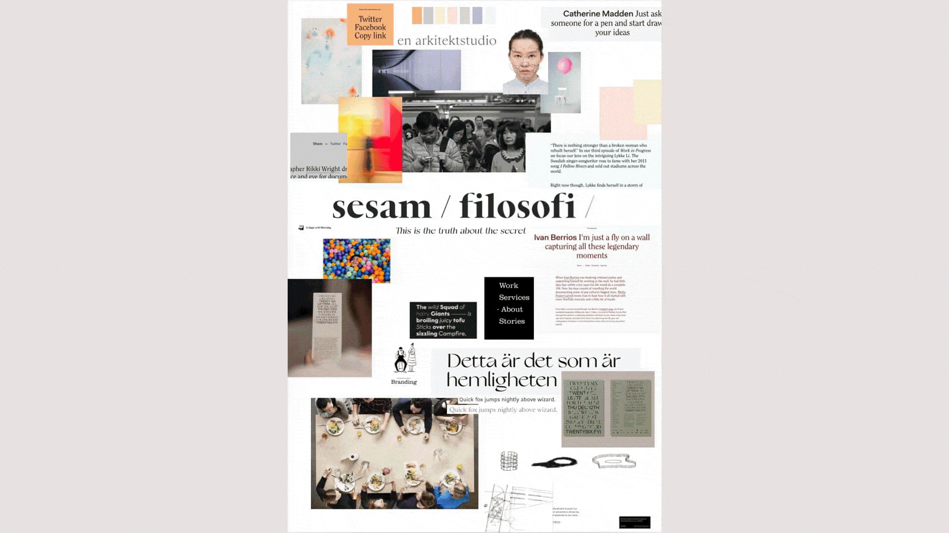
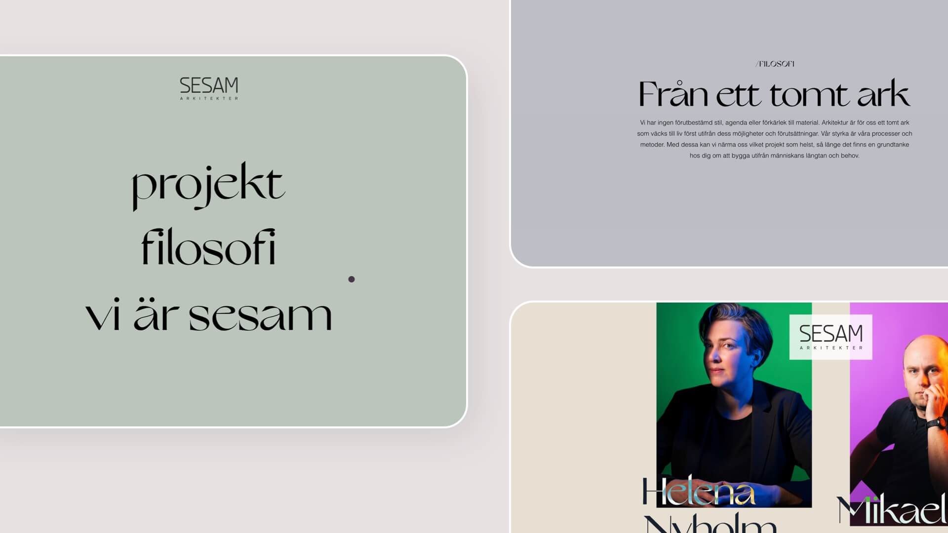
We started out with a workshop, together with Sesam, to gain insight of what they wanted to be as a brand. Through endless scribbles and notes the workshop gave us the direction to focus on simplicity, colors and playfulness. We immediately started to put together a moodboard.
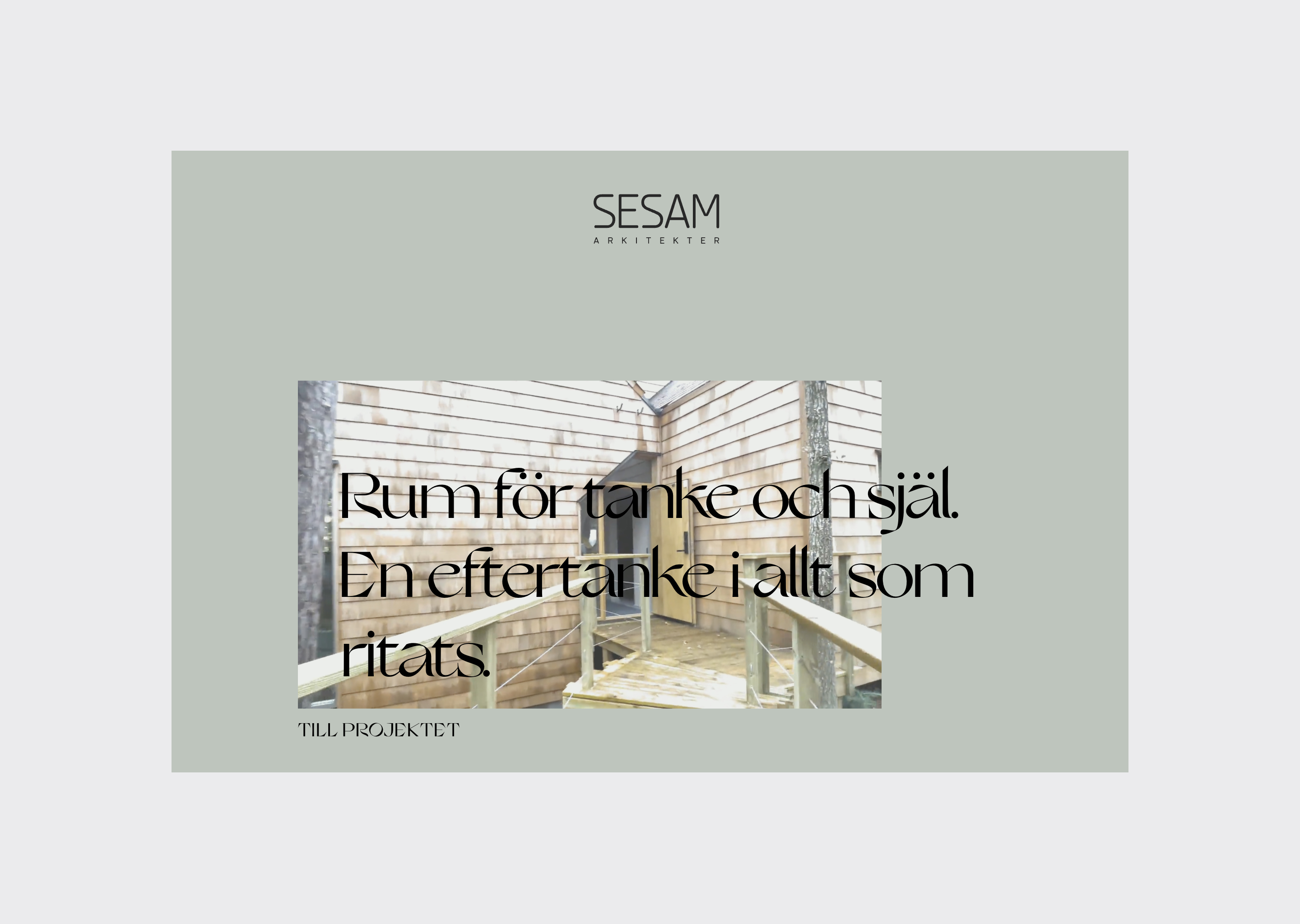
The market analysis gave me an opportunity to take another road of what the ”regular” architectural firms had done. And it gave me an idea of how to build the sitemap. A simple yet functional sitemap for the visitors.
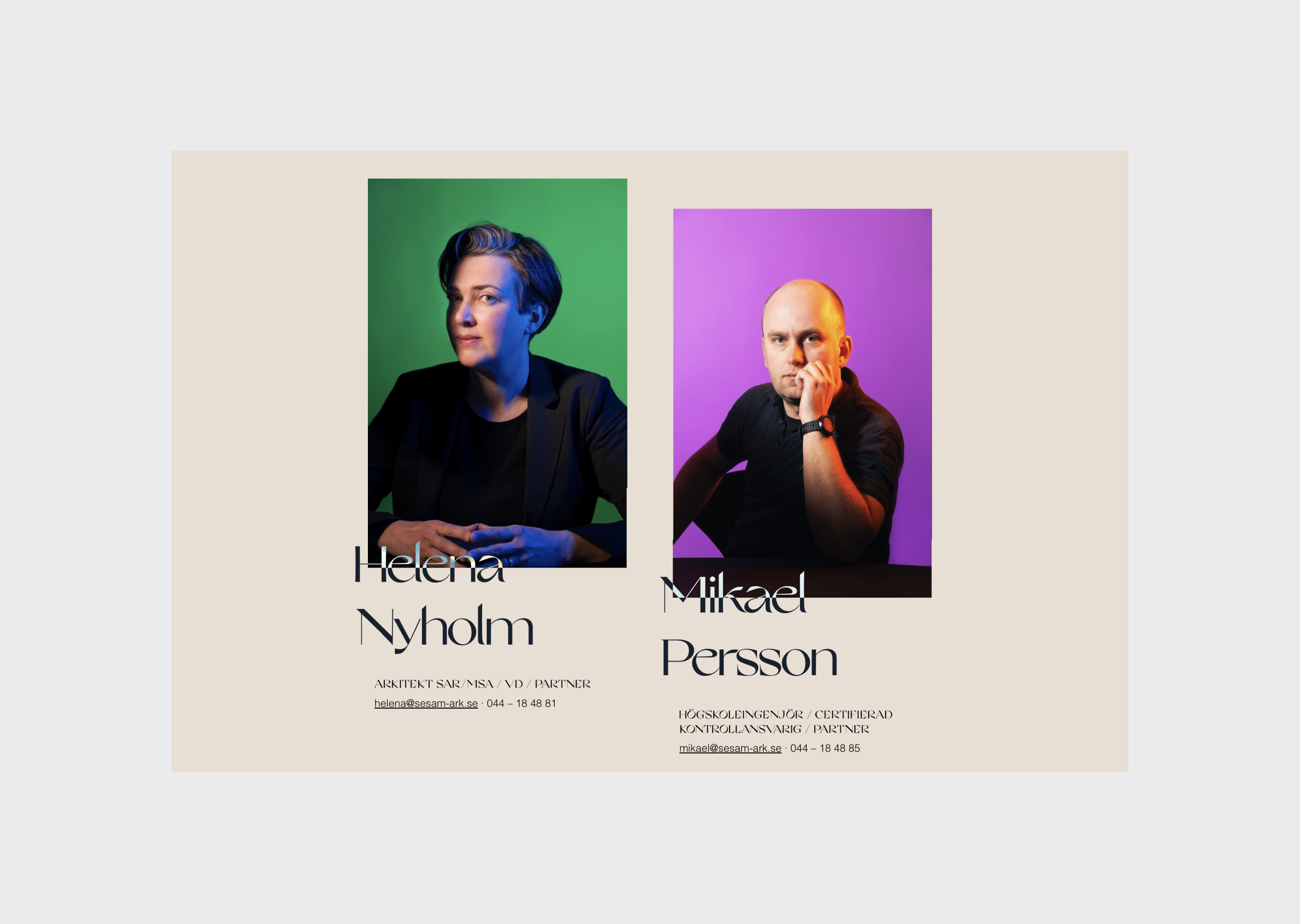
The trickiest part of the process was the color scheme. The pastel colors together with the growing interface made a childish look. Even though they wanted us to focus on a playful experience - this wasn’t what I wanted at all. I wanted a more serious experience whilst colorful. To compensate I made the colors more grounded, catching that seriousness through colors and interactions.